It has to be admitted that this whole Metaverse thing has taken colour scholars by storm. In fact, during the announcement of the colour of the year 2023, Pantone paraphrased: “Welcome to the Magentaverse”. It can be no coincidence that, after NCS and RAL, the Pantone Institute also winks at the virtual world. And so Viva Magenta 18-1750 sends Very Peri into retirement. It had been since 2011 with Honeysuckle 18-2120 that something similar had not been seen. While the graphics, as always, will draw inspiration (Tik Tok’s buttons are already like that), we express a firm scepticism that the vibrancy of Magenta will affect interior designers.
The technology of virtual and the nature of cochineal
According to Leatrice Eiseman, Executive Director of Pantone Colour Institute, «in this age of technology, we try to draw inspiration from nature and what is real. Pantone 18-1750 Viva Magenta is descended from the red family and is inspired by cochineal red, one of the most precious dyes in the natural dyes family and one of the strongest and brightest the world has ever known.»
And indeed, the history of cochineal, as a dye, is very deep-rooted. Scarlet red has always been a symbol of wealth and social status. After the discovery of the Aztec civilisation, which had been using the insect from which this dye is derived for centuries, people in Europe were prepared to spend huge sums to ensure its conspicuousness.

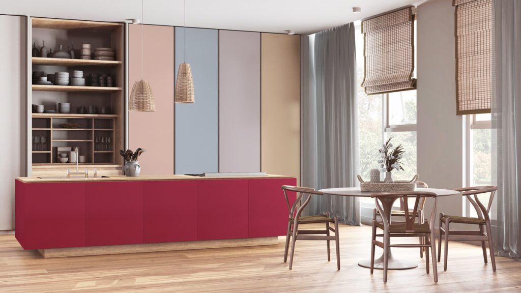
Pale Dogwood
13-1404
Gray Sand
13-1010
Gray Lilac
13-3804
Viva Magenta
18-1750
Pale Khaki
15-1216
Fields of Rye
15-1115
Agate Gray
15-6307
Plein Air
13-4111